Stylish Dream Kitchens

A place to nurture both family and soul, kitchens are truly the heart of the home. As the hub of modern day family life, the kitchen provides nourishment on many levels. This hard working center of domestic life is a gathering spot for family and friends, a place to prepare meals or work on projects. When entertaining, guests tend to congregate in the kitchen because where there is food people will undoubtedly follow. Dream kitchens are a unique reflection of those who occupy the home, revealing their vitality and style.
Kitchens have evolved from their traditional utilitarian roots: simple practicality, functional space and organization. Today, kitchens have not only joined the technological revolution but are designed to express the personal aesthetic and lifestyle of the homeowner. Beyond efficiency and logic, contemporary kitchen styles range from professional grade appliances that would impress a gourmet cook to high style workspaces that merge with the ebb and flow of family life. Other kitchens are places to artistically highlight treasured collections or incorporate elements of charm and individuality. These Montana kitchens offer a glimpse into the aesthetics and progressive technological advances in today’s kitchen trends.
Log Living
Steve and Lona Petri created a sleek and stylish kitchen within the rustic ambiance of their log home. With open, 24-foot ceilings which feature massive log beams, the Petris wanted to achieve a more intimate feel in the kitchen. “We placed four log beams much lower over the kitchen to create this atmosphere,” said Lona. “It visually reduces the volume of the large space. It’s still open but it creates the illusion of coziness.”
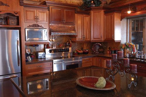
Cherry cabinets, in an L-shaped configuration, create an efficient traffic flow. The cherry cabinetry also adds a hint of formal elegance and sets the kitchen apart from the woodsy and inviting mood of the living room. “We chose cherry because it gave an entirely different feel to the kitchen,” she said. “It’s a bit more formal than the rest of the house.” Three different finishes were used on the cabinets to highlight the beautiful wood grain.
The Petris added leaded glass cabinet doors not only for visual interest but also to display Lona’s colorful Denby dishes. “Cabinets can be so uniform looking,” she said. “In a log home it is very monochromatic with all of the wood. You have to look for ways to add splashes of color to make it beautiful and interesting.” Indeed, Lona carried the infusion of color from the lively blue, green and burgundy dishes into the curtains and the carpets of the kitchen and breakfast nook.
With such an open floor plan and the massive size of the logs, special consideration had to be given to the scale of the kitchen. “When we drew it out on paper in the design process, the kitchen was originally much smaller,” Lona said. “But when the house was being built, we realized that some modifications were needed to take the scale into account.” Lona decided to have 4 _ foot walkways around the work areas. “Despite our earlier reservations, we have found it to be just the perfect size to work side-by-side and not be in each other’s way,” she said.
Incorporating an oversized, six by eight foot island into the kitchen was another change dictated by the scale of the house. “It was much smaller in the planning stages,” she said. “I am so pleased with the change.” With ample workspace and storage, it is also the perfect gathering spot for entertaining with bar seating on two sides. “It’s a very usable space,” said Lona. “And it is perfect for setting up a buffet.” The island also provides a natural division between the great room and the kitchen.
A sleek, black granite countertop was chosen for the island and around the sink. The granite has a hint of green, adding another touch of color as it plays off the light. The remainder of the counters and backsplash were finished in a mellow, caramel toned travertine tile which complements the cabinets and interior log walls. Copper edging and copper clad tiles highlight the beauty of the travertine.
Another touch of copper is used in the functional, yet artful custom range hood. “It was designed to have an old world feel,” Lona said. “The hammered copper adds another element of texture.” A hammered gray metal plate finishes the piece and ties into the stainless appliances and cabinetry hardware. “The textured metal gives the hood a primitive look, which works well with the logs.”
The careful placement of windows allows the flow of natural light in the kitchen, always an important factor in a log home. The large bay window over the sink allows views of the garden area. A distinctive, octagon-shaped breakfast nook is a true showpiece. Feeling more like an outdoor gazebo, this delightful nook incorporates windows while maintaining the character and shape of the logs. “Notches were cut into the logs so the glass could slide in, leaving the logs intact,” Lona said. “You can still see the knots in the wood around the glass. It’s not flat like a traditional window.” Panels of glass, nearly floor to ceiling were installed to create this outdoor feel year-round. A cowboy chandelier above the table adds a touch of western whimsy.
The Petris are pleased to have created this intimate, stylish kitchen. “I love that it works with the great room,” Lona said. “It’s so enjoyable to have that feel of togetherness no matter where you are. This kitchen is just a dream.”

Artistic Vision
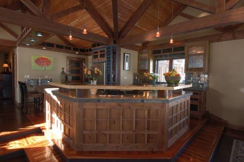
For Rob and Chrissy Evans, building a new home gave them the opportunity to display their respective talents. Chrissy’s experience with pottery gave her the perfect opportunity to use her knowledge of clays and glazes to create a kitchen that would be completely unique. Rob, a homebuilder, saw the kitchen as place to display his flair for woodworking. He also wanted to incorporate concrete as a design element. Their goal was to create a bold artistic statement, with a mix of styles, in their custom home.
Chrissy handcrafted over 5000 tiles to add a distinctly personal touch to their home. “I experimented with glaze colors and oxide washes for over a year to develop our color palette,” she said. She also obtained antique batik print blocks which she used to texture the tiles. “I wanted to create a random mix of textures and colors with architectural interest,” she said. The kitchen tiles establish the inviting color palette in subtle blues, greens and golds that blend beautifully with the winter wheat walls. Larger 4x4 tiles cover the backsplash which are framed by embellished and textured rectangular trim pieces. Chrissy hand-built tiles with a curved lip for the windowsill.
All of the alder cabinets were custom-made and colored with an lightly tinted tung oil which highlights the beauty of the wood. Rob incorporated a pleasing grid pattern on the surfaces of the cabinets visible from the great room. A variation of the grid is repeated in the L-shaped, minimalist light fixture above the bar seating area. Door and drawer fronts are enhanced by metal inserts with a patina finish. The upper cabinet doors feature clear reed glass with backlighting. “It highlights the texture of the glass,” Chrissy said. A custom wine rack is finished in a stain matching the tiles.
Rob and Chrissy collaborated on the concrete countertop surfaces. “Concrete is so versatile,” said Rob. “The three-dimensional design possibilities are limitless.” After Rob built the molds to fit the cabinets, the couple worked side-by-side throughout the numerous steps to complete the process. Grinding and polishing took many hours of their labor but the results were well worth the effort. These sleek, modern countertops have an added punch of color from Chrissy’s fused glass pieces which were embedded in the concrete. The countertops weighed over 650 pounds each and took six men to carry them in for installation.
The kitchen was raised to offset it from the great room. “We wanted a change in height to differentiate the space,” Rob said. “We also thought it would make the kitchen aesthetically compact.” Two steps up from the stained concrete floors, hardwood cherry flooring offers a warm contrast. “We wanted the kitchen to feel as comfortable and welcoming as the living area,” Chrissy said. Thoughtful placement of ample task and ambient lighting also sets the space apart.
A large island incorporates a professional style stainless gas stove and features a handcrafted wood and steel shelf. “The wood for the shelf was a five inch thick slab of ash,” said Rob. “I used a chain saw and a skill saw to shape the wood. The space for the track lighting was hand hewn later.” Rustic steel inserts support the shelf.
The Evans achieved their goal of a totally unique kitchen, rich in custom details and personal touches. Rob attributes the success of the project to meticulous planning and attention to detail. “We were nearly fanatical about it,” he said. “But all of our planning paid off. This kitchen absolutely exceeded our expectations.”

Modern Motivations
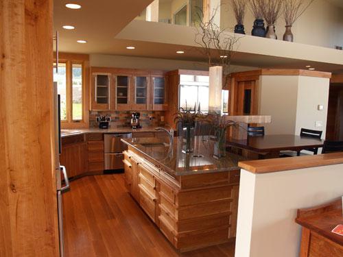
Terry Thompson and Mike Simmonds knew exactly what they wanted when designing their new kitchen. Architect Brendon Beyers captured the couple’s vision and translated it into a light-filled, contemporary kitchen which blends seamlessly into the home’s main living area.
Knowing that their guests tend to congregate in the kitchen, Mike and Terry wanted an island with bar seating. This 5 _ by 7 _ foot, multi-tiered island is the unique focal point of this custom kitchen. The elegant color scheme for the kitchen evolved naturally from the striking piece of recycled eucalyptus which was chosen for the top of the sitting bar. This richly colored wood top is supported by four architectural pillars. The upper level of the bar conceals the distinctive cantilevered underlighting system, which provides task lighting for the island and sitting bar.
The cabinetry, designed by Beyers and built by Steve Gray, mixes sophisticated yet simple geometric elements. Upper cabinets with reed glass fronts artfully incorporate asymmetrical steel rods as handles. Although reed glass typically has a vertical placement, Terry opted for a horizontal display. “The horizontal lines were visually soothing and matched the line of the cabinets below,” she said.
Terry’s extensive research led her to choose a Dacor six burner gas, drop-in cooktop. “It is professional grade with 15,000 BTUs,” she said. “I also liked the placement the controls in front.” She also chose a Dacor double oven with a combination microwave/ convection oven in stainless steel. A Fischer & Paykel two-drawer dishwasher allows for separate operation of the units. “It’s convenient for smaller loads and odd sized items,” she said. Terry chose a 42 inch KitchenAid refrigerator. “Many homes now use the 48 inch model but I preferred this size,” she said. “We made the space large enough to accommodate the larger size but added built-ins to fill in the extra space.” Indeed the space was thoughtfully utilized with a handy, two-level pull out cabinet to store all of Terry’s baking essentials. A walk-in pantry, with an automatic light, has ample shelving for every storage need.
When planning the cabinet design, Terry liked the concept of pull-out drawers rather than traditional cabinets for the lower units. “They are so convenient,” she said. Pull-outs of all different sizes neatly house everything from pots and pans to cookie sheets and cooling racks.
Granite countertops add subtle color and movement which blend beautifully with the eucalyptus and cherry. “The granite was a medium tone and it added just the right amount of color,” she said. Rectangular glass tiles in gold, tan and iridescent bronze infuse another splash of color.
Terry and Mike are understandably pleased with their modern, streamlined kitchen. “It was so much fun to design,” she said.
These dream kitchens provide just a few examples of design possibilities to fuel your imagination. So whether your taste is traditional, modern or somewhere in between, there is a perfect kitchen to express your distinctive style, reflect your passions and meet your lifestyle needs.
~ Denise Malloy is a freelance writer living in Bozeman, Montana.
Leave a Comment Here
Leave a Comment Here